April 2, 2020
I believe that every number has a story behind it. In market research, every data point, every number, ultimately links to someone with a story. And the stories revealed in data have the power to answer questions.
Research starts with questions. What are people thinking and feeling? Where are they going and why? How are people choosing to spend money? Right now, our world is facing serious questions in the midst of a crisis brought on by the COVID-19 pandemic. Overnight, whole industries have been disrupted, and the world is looking to understand new complexities to make decisions and take the right actions.
At Escalent, we research human behavior to help organizations take action in a world of disruption. And sadly, our world right now is in a crisis that has spiked disruption. But as a story architect on a team of information designers, I have the opportunity to bring my belief that numbers tell stories into this crisis, and along with my team and company, will use visualization tools to help shape and convey those stories. That’s why I’m proud of how so many organizations and individuals are rallying around data visualization in this time—creating charts, sharing animated graphs, designing infographics, and using dashboards—all to help guide us in answering tough questions and to better understand our global story.
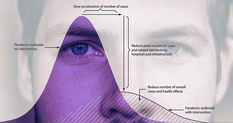
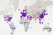 Data are woven through our connected world and reveal facets of our collective stories. As the world uses data visualizations right now to navigate this crisis, people will know more about why to stay at home as they understand what exponential growth looks like. A picture is worth a thousand words, but a chart is worth a thousand data points. When people can compare data sets with ease, seeing projected spikes in medical cases as visual curves, or as circles linked to affected populations on a map, it makes it easier for such data to impact us.
As we face great disruption, questions, and the need to understand and take action, paying attention to numbers and learning from data is not only important, it can be an act of love. Learning from charts and looking at data with open eyes and an open heart supports our collective well-being when faced with such a connected and collective crisis. Seeing a global heat map of viral outbreaks becomes a sobering call to action. Seeing a line chart of those who have recovered stands as a tangible image of hope.
Ultimately, we can use these visualizations to spur us to take part in changing the data themselves, to make a positive difference for elderly family members, for our next-door neighbors, and even for people we will never meet. When we are choosing to stay at home, we aren’t just practicing extreme social distancing or self-quarantine, we are taking part in a global movement to “flatten the curve.”
So keep on reading the infographics, share the charts on social media, and spread the visual data of our world. I believe that every number has a story. And today, that story is ours.
To learn more about how Escalent can help you find meaning and reveal the stories in your data, contact info@escalent.co.

Steven Homestead
Story Architect
Steven Homestead is a former Story Architect with the Information Design team at Escalent.